Background

The background plugin is used to customize canvas background effects, supporting dot patterns, logo display, and neumorphism visual effects.

Background Configuration

The background plugin is provided through BackgroundPlugin, configuration options include:

Basic Configuration
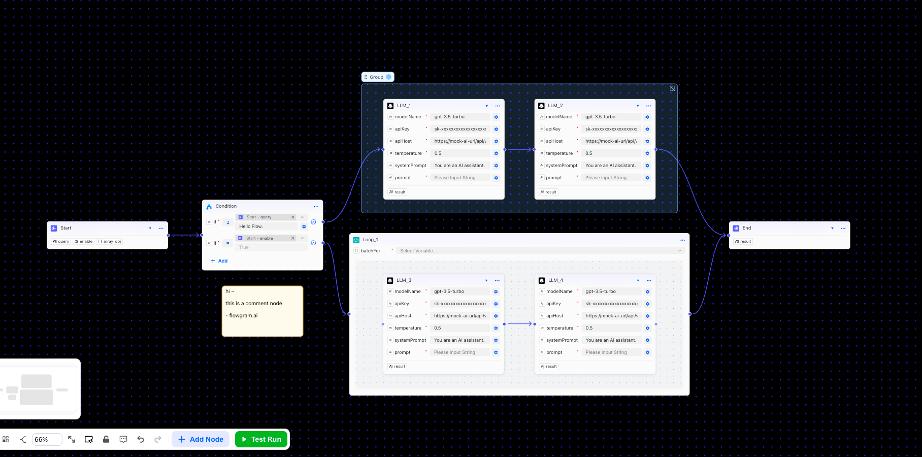
{
  // Background color
  backgroundColor: '#1a1a1a',

  // Dot color
  dotColor: '#ffffff',

  // Dot size (pixels)
  dotSize: 1,

  // Grid spacing (pixels)
  gridSize: 20,

  // Dot opacity (0-1)
  dotOpacity: 0.5,

  // Dot fill color
  dotFillColor: '#ffffff'
}

Logo Configuration

Supports both text and image logo types:
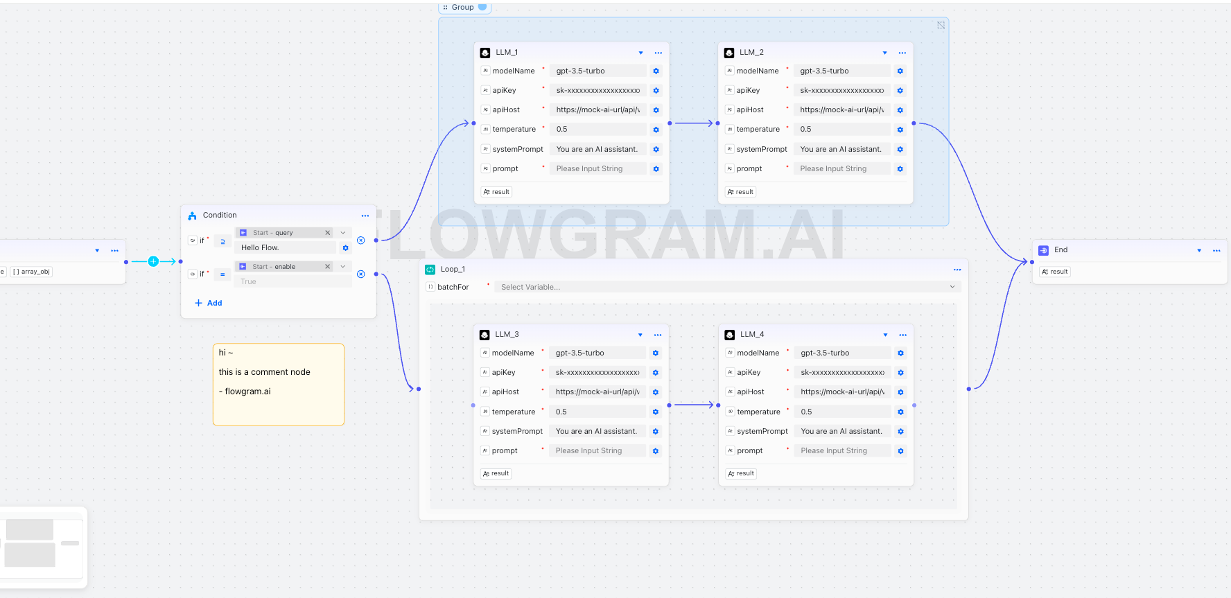
{
  logo: {
    // Logo text
    text: 'FLOWGRAM.AI',

    // Image URL (optional, higher priority than text)
    imageUrl: 'https://example.com/logo.png',

    // Position: 'center' | 'top-left' | 'top-right' | 'bottom-left' | 'bottom-right'
    position: 'center',

    // Size
    size: 200,

    // Opacity (0-1)
    opacity: 0.25,

    // Color
    color: '#ffffff',

    // Font family
    fontFamily: 'Arial, sans-serif',

    // Font weight
    fontWeight: 'bold',

    // Custom offset
    offset: { x: 0, y: 0 }
  }
}

Neumorphism Effect

Neumorphism is a modern visual design style that creates depth through dual soft shadows:
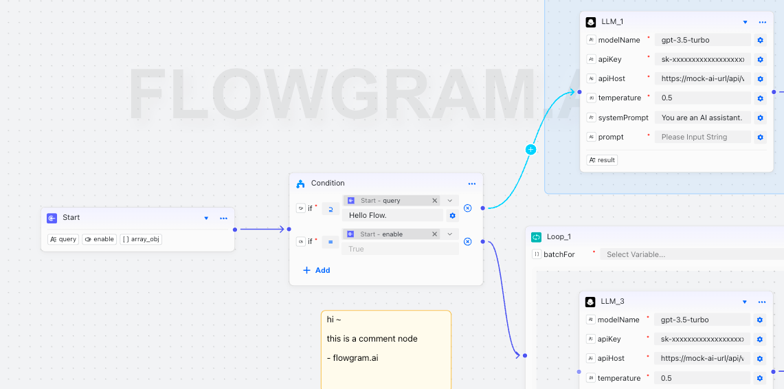
{
  logo: {
    neumorphism: {
      // Enable neumorphism effect
      enabled: true,

      // Text color
      textColor: '#E0E0E0',

      // Light shadow color
      lightShadowColor: 'rgba(255,255,255,0.9)',

      // Dark shadow color
      darkShadowColor: 'rgba(0,0,0,0.15)',

      // Shadow offset distance
      shadowOffset: 6,

      // Shadow blur radius
      shadowBlur: 12,

      // Shadow intensity
      intensity: 0.6,

      // Raised effect (true=raised, false=inset)
      raised: true
    }
  }
}

Usage Example

// Use background property directly in editor configuration
const editorProps = {
  // Background configuration
  background: {
    // Dark theme background
    backgroundColor: '#1a1a1a',
    dotColor: '#ffffff',
    dotSize: 1,
    gridSize: 20,
    dotOpacity: 0.3,

    // Brand logo
    logo: {
      text: 'FLOWGRAM.AI',
      position: 'center',
      size: 200,
      opacity: 0.25,
      color: '#ffffff',
      fontFamily: 'Arial, sans-serif',
      fontWeight: 'bold',

      // Neumorphism effect
      neumorphism: {
        enabled: true,
        textColor: '#E0E0E0',
        lightShadowColor: 'rgba(255,255,255,0.9)',
        darkShadowColor: 'rgba(0,0,0,0.15)',
        shadowOffset: 6,
        shadowBlur: 12,
        intensity: 0.6,
        raised: true
      }
    }
  }
}

Preset Styles

Classic Dark Theme

const editorProps = {
  background: {
    backgroundColor: '#1a1a1a',
    dotColor: '#ffffff',
    dotSize: 1,
    gridSize: 20,
    dotOpacity: 0.3,
    logo: {
      text: 'Your Brand',
      position: 'center',
      size: 200,
      opacity: 0.25,
      color: '#ffffff',
      neumorphism: {
        enabled: true,
        textColor: '#E0E0E0',
        lightShadowColor: 'rgba(255,255,255,0.9)',
        darkShadowColor: 'rgba(0,0,0,0.15)',
        shadowOffset: 6,
        shadowBlur: 12,
        intensity: 0.6,
        raised: true
      }
    }
  }
}

Minimal White Theme

const editorProps = {
  background: {
    backgroundColor: '#ffffff',
    dotColor: '#000000',
    dotSize: 1,
    gridSize: 20,
    dotOpacity: 0.1,
    logo: {
      text: 'Your Brand',
      position: 'center',
      size: 200,
      opacity: 0.1,
      color: '#000000'
    }
  }
}

Notes

  1. Color Matching: Ensure sufficient contrast between logo color and background color
  2. Opacity Settings: Logo opacity should not be too high to avoid affecting content readability
  3. Neumorphism Effect: Shadow parameters should be adjusted reasonably, overly strong effects may distract attention
  4. Performance Considerations: Complex shadow effects may impact rendering performance, consider simplifying on low-end devices

Type Definitions

interface BackgroundLayerOptions {
  /** Grid spacing, default 20px */
  gridSize?: number;
  /** Dot size, default 1px */
  dotSize?: number;
  /** Dot color, default "#eceeef" */
  dotColor?: string;
  /** Dot opacity, default 0.5 */
  dotOpacity?: number;
  /** Background color, default transparent */
  backgroundColor?: string;
  /** Dot fill color, default same as stroke color */
  dotFillColor?: string;
  /** Logo configuration */
  logo?: {
    /** Logo text content */
    text?: string;
    /** Logo image URL */
    imageUrl?: string;
    /** Logo position, default 'center' */
    position?: 'center' | 'top-left' | 'top-right' | 'bottom-left' | 'bottom-right';
    /** Logo size, default 'medium' */
    size?: 'small' | 'medium' | 'large' | number;
    /** Logo opacity, default 0.1 */
    opacity?: number;
    /** Logo color (text only), default "#cccccc" */
    color?: string;
    /** Logo font family (text only), default 'Arial, sans-serif' */
    fontFamily?: string;
    /** Logo font weight (text only), default 'normal' */
    fontWeight?: 'normal' | 'bold' | 'lighter' | number;
    /** Custom offset */
    offset?: { x: number; y: number };
    /** Neumorphism effect configuration */
    neumorphism?: {
      /** Enable neumorphism effect */
      enabled: boolean;
      /** Text color */
      textColor?: string;
      /** Light shadow color */
      lightShadowColor?: string;
      /** Dark shadow color */
      darkShadowColor?: string;
      /** Shadow offset distance */
      shadowOffset?: number;
      /** Shadow blur radius */
      shadowBlur?: number;
      /** Shadow intensity */
      intensity?: number;
      /** Raised effect (true=raised, false=inset) */
      raised?: boolean;
    };
  };
}