@flowgram.ai/background-plugin

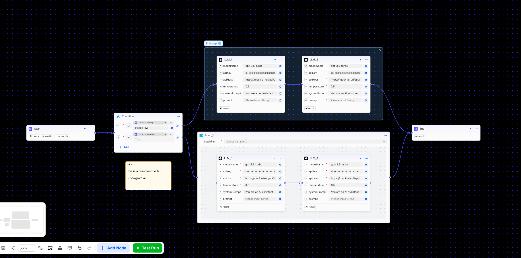
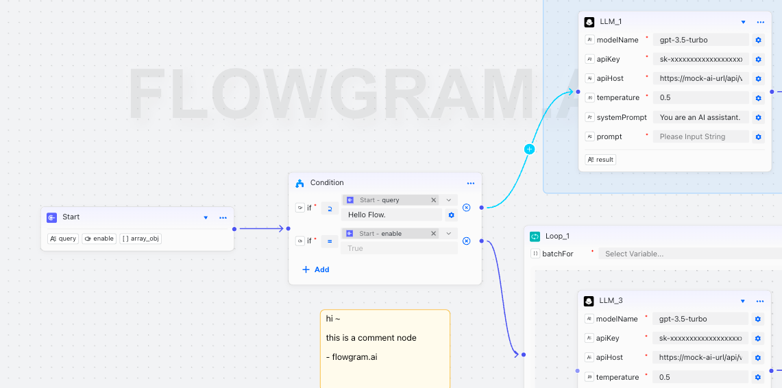
The background plugin is used to customize canvas background effects, supporting dot patterns, logo display, and neumorphism visual effects.

Background Configuration

The background plugin is provided through @flowgram.ai/background-plugin(built-in), configuration options include:

Basic Configuration

{
  // Background color
  backgroundColor: '#1a1a1a',

  // Dot color
  dotColor: '#ffffff',

  // Dot size (pixels)
  dotSize: 1,

  // Grid spacing (pixels)
  gridSize: 20,

  // Dot opacity (0-1)
  dotOpacity: 0.5,

  // Dot fill color
  dotFillColor: '#ffffff'
}

Logo Configuration

Supports both text and image logo types:
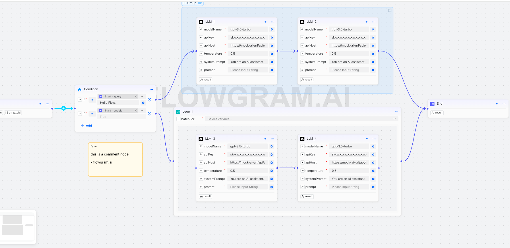
{
  logo: {
    // Logo text
    text: 'FLOWGRAM.AI',

    // Image URL (optional, higher priority than text)
    imageUrl: 'https://example.com/logo.png',

    // Position: 'center' | 'top-left' | 'top-right' | 'bottom-left' | 'bottom-right'
    position: 'center',

    // Size
    size: 200,

    // Opacity (0-1)
    opacity: 0.25,

    // Color
    color: '#ffffff',

    // Font family
    fontFamily: 'Arial, sans-serif',

    // Font weight
    fontWeight: 'bold',

    // Custom offset
    offset: { x: 0, y: 0 }
  }
}

Neumorphism Effect

Neumorphism is a modern visual design style that creates depth through dual soft shadows:

{
  logo: {
    neumorphism: {
      // Enable neumorphism effect
      enabled: true,

      // Text color
      textColor: '#E0E0E0',

      // Light shadow color
      lightShadowColor: 'rgba(255,255,255,0.9)',

      // Dark shadow color
      darkShadowColor: 'rgba(0,0,0,0.15)',

      // Shadow offset distance
      shadowOffset: 6,

      // Shadow blur radius
      shadowBlur: 12,

      // Shadow intensity
      intensity: 0.6,

      // Raised effect (true=raised, false=inset)
      raised: true
    }
  }
}

Usage Example

// Use background property directly in editor configuration
const editorProps = {
  // Background configuration
  background: {
    // Dark theme background
    backgroundColor: '#1a1a1a',
    dotColor: '#ffffff',
    dotSize: 1,
    gridSize: 20,
    dotOpacity: 0.3,

    // Brand logo
    logo: {
      text: 'FLOWGRAM.AI',
      position: 'center',
      size: 200,
      opacity: 0.25,
      color: '#ffffff',
      fontFamily: 'Arial, sans-serif',
      fontWeight: 'bold',

      // Neumorphism effect
      neumorphism: {
        enabled: true,
        textColor: '#E0E0E0',
        lightShadowColor: 'rgba(255,255,255,0.9)',
        darkShadowColor: 'rgba(0,0,0,0.15)',
        shadowOffset: 6,
        shadowBlur: 12,
        intensity: 0.6,
        raised: true
      }
    }
  }
}

Preset Styles

Classic Dark Theme

const editorProps = {
  background: {
    backgroundColor: '#1a1a1a',
    dotColor: '#ffffff',
    dotSize: 1,
    gridSize: 20,
    dotOpacity: 0.3,
    logo: {
      text: 'Your Brand',
      position: 'center',
      size: 200,
      opacity: 0.25,
      color: '#ffffff',
      neumorphism: {
        enabled: true,
        textColor: '#E0E0E0',
        lightShadowColor: 'rgba(255,255,255,0.9)',
        darkShadowColor: 'rgba(0,0,0,0.15)',
        shadowOffset: 6,
        shadowBlur: 12,
        intensity: 0.6,
        raised: true
      }
    }
  }
}

Minimal White Theme

const editorProps = {
  background: {
    backgroundColor: '#ffffff',
    dotColor: '#000000',
    dotSize: 1,
    gridSize: 20,
    dotOpacity: 0.1,
    logo: {
      text: 'Your Brand',
      position: 'center',
      size: 200,
      opacity: 0.1,
      color: '#000000'
    }
  }
}

Notes

  1. Color Matching: Ensure sufficient contrast between logo color and background color
  2. Opacity Settings: Logo opacity should not be too high to avoid affecting content readability
  3. Neumorphism Effect: Shadow parameters should be adjusted reasonably, overly strong effects may distract attention
  4. Performance Considerations: Complex shadow effects may impact rendering performance, consider simplifying on low-end devices

Type Definitions

interface BackgroundLayerOptions {
  /** Grid spacing, default 20px */
  gridSize?: number;
  /** Dot size, default 1px */
  dotSize?: number;
  /** Dot color, default "#eceeef" */
  dotColor?: string;
  /** Dot opacity, default 0.5 */
  dotOpacity?: number;
  /** Background color, default transparent */
  backgroundColor?: string;
  /** Dot fill color, default same as stroke color */
  dotFillColor?: string;
  /** Logo configuration */
  logo?: {
    /** Logo text content */
    text?: string;
    /** Logo image URL */
    imageUrl?: string;
    /** Logo position, default 'center' */
    position?: 'center' | 'top-left' | 'top-right' | 'bottom-left' | 'bottom-right';
    /** Logo size, default 'medium' */
    size?: 'small' | 'medium' | 'large' | number;
    /** Logo opacity, default 0.1 */
    opacity?: number;
    /** Logo color (text only), default "#cccccc" */
    color?: string;
    /** Logo font family (text only), default 'Arial, sans-serif' */
    fontFamily?: string;
    /** Logo font weight (text only), default 'normal' */
    fontWeight?: 'normal' | 'bold' | 'lighter' | number;
    /** Custom offset */
    offset?: { x: number; y: number };
    /** Neumorphism effect configuration */
    neumorphism?: {
      /** Enable neumorphism effect */
      enabled: boolean;
      /** Text color */
      textColor?: string;
      /** Light shadow color */
      lightShadowColor?: string;
      /** Dark shadow color */
      darkShadowColor?: string;
      /** Shadow offset distance */
      shadowOffset?: number;
      /** Shadow blur radius */
      shadowBlur?: number;
      /** Shadow intensity */
      intensity?: number;
      /** Raised effect (true=raised, false=inset) */
      raised?: boolean;
    };
  };
}